
As the years go by, smartphones, laptops, and the companies that create them look more and more the same. Minimal. White. Precise. A little boring? Lenovo’s ideal is ‘different is better’ and they’re in a category where everything looks like it was Designed in California.
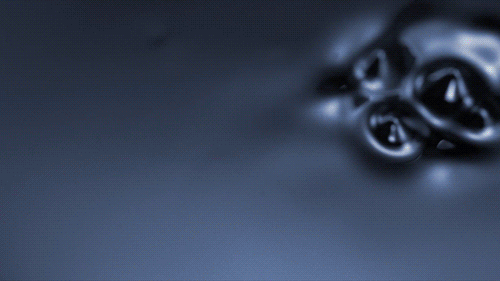
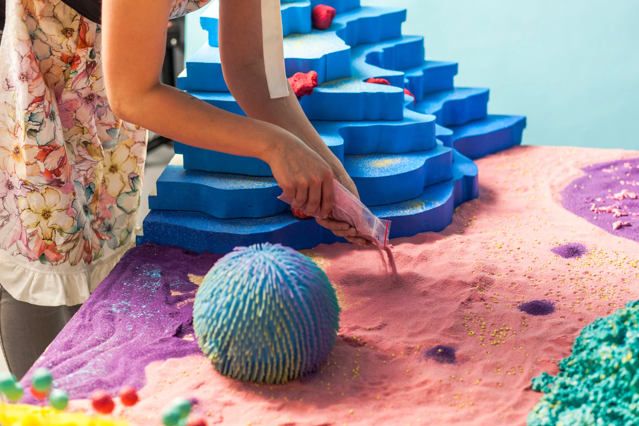
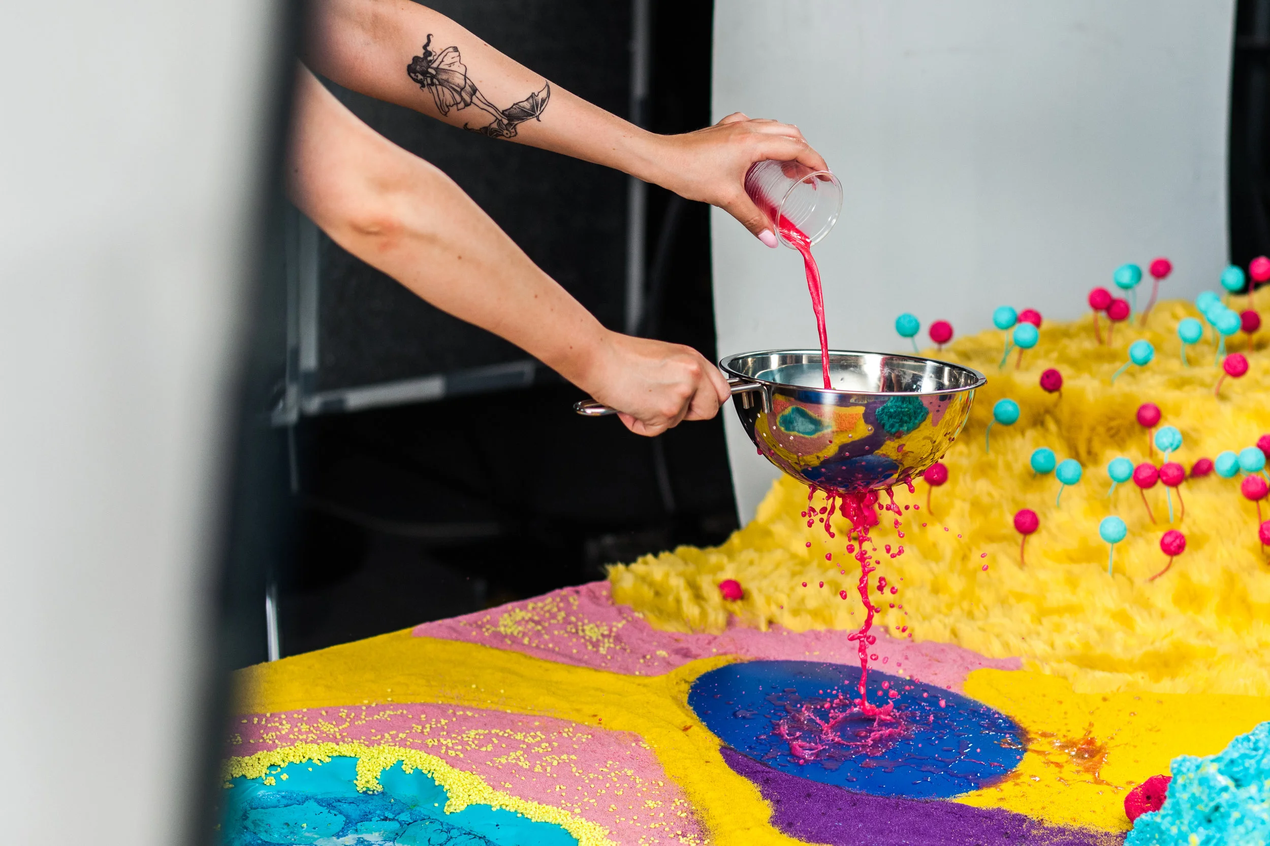
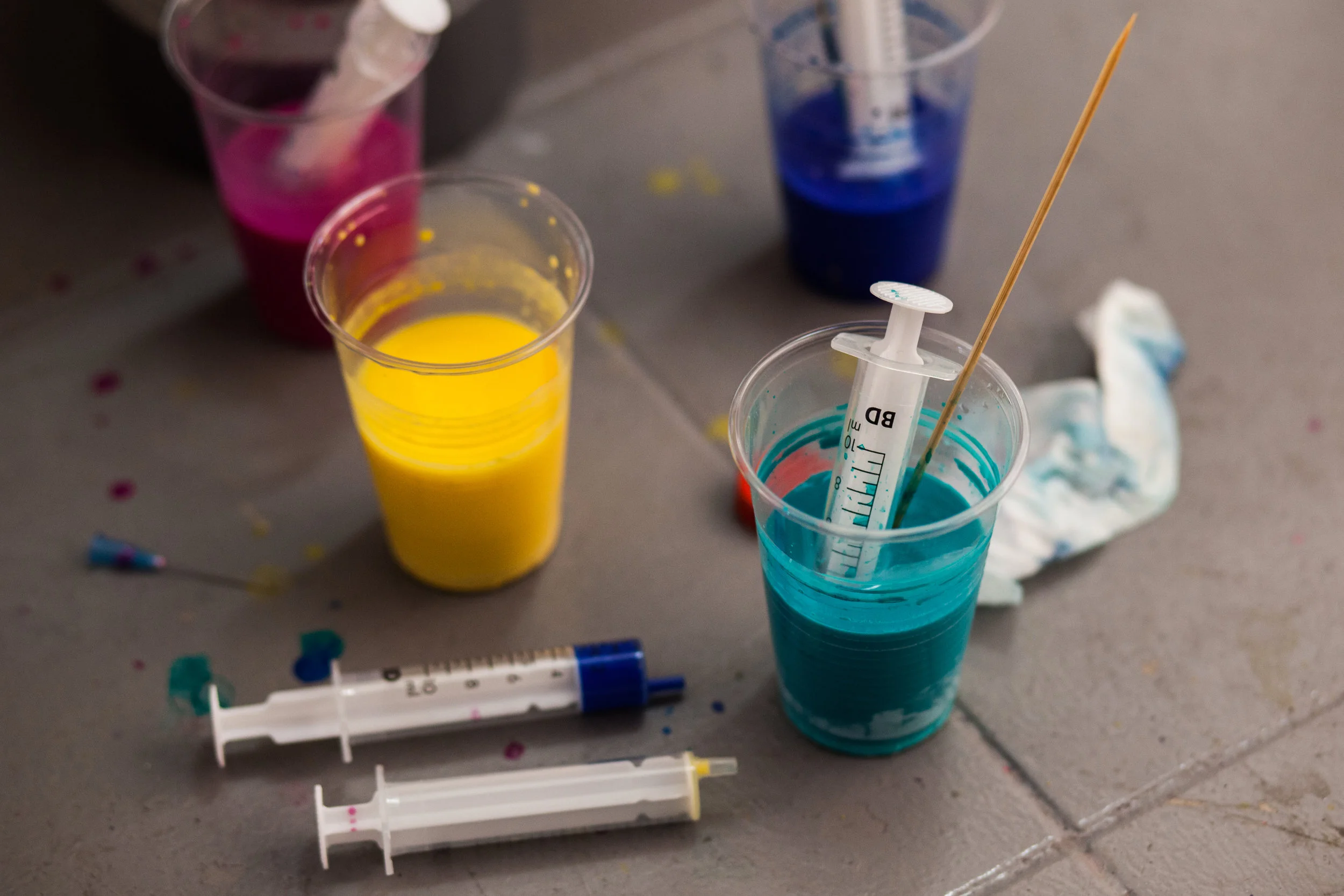
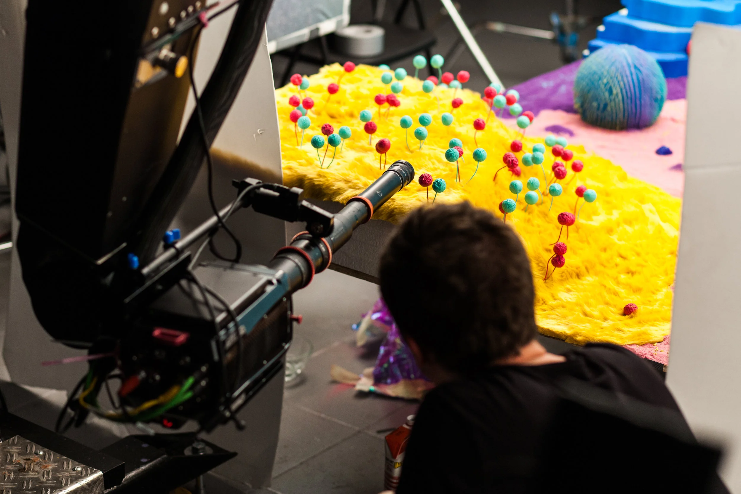
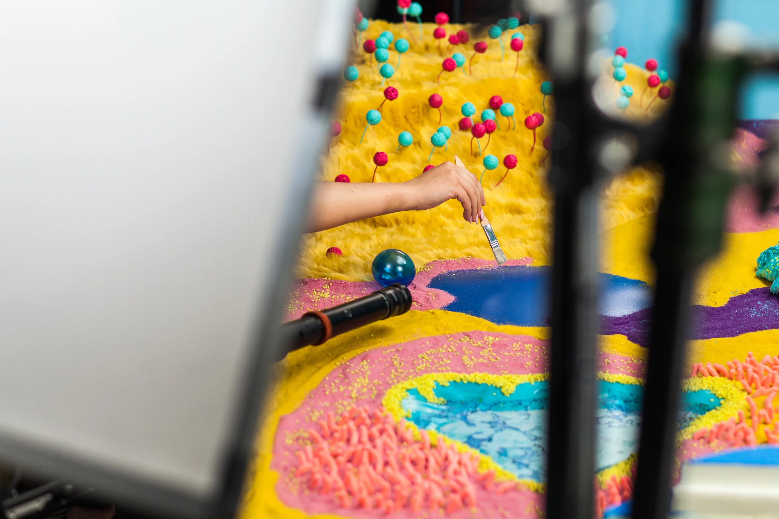
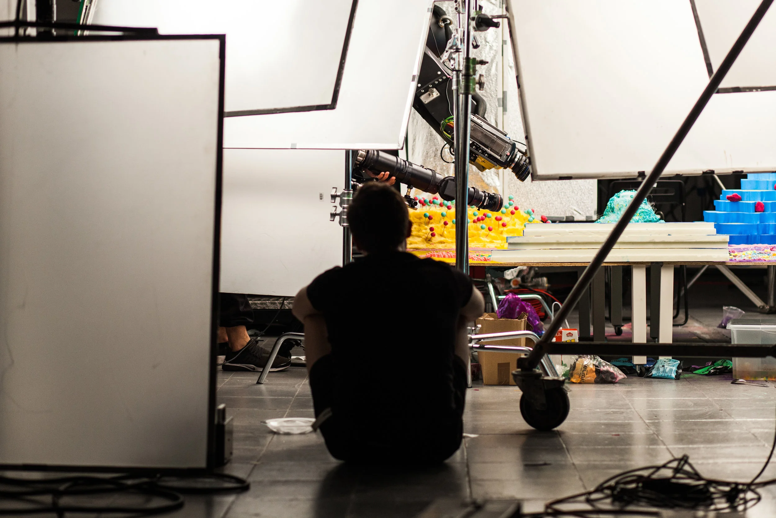
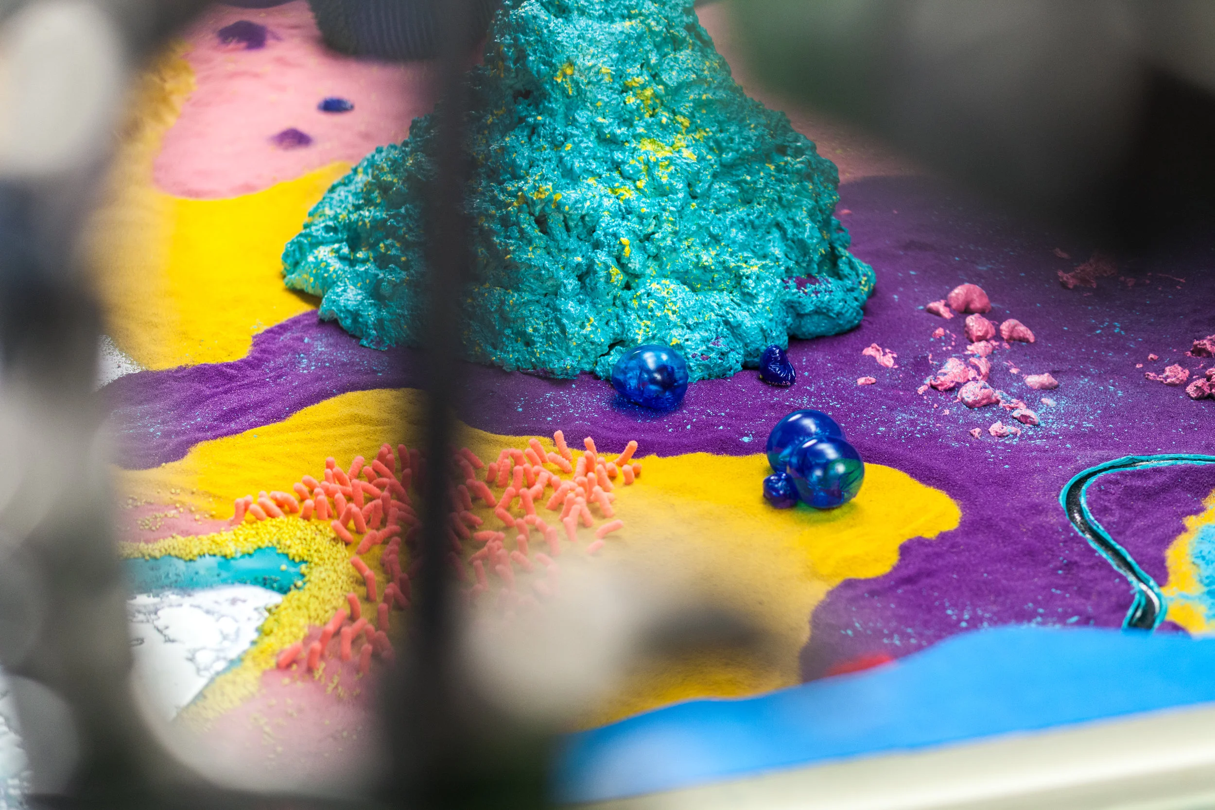
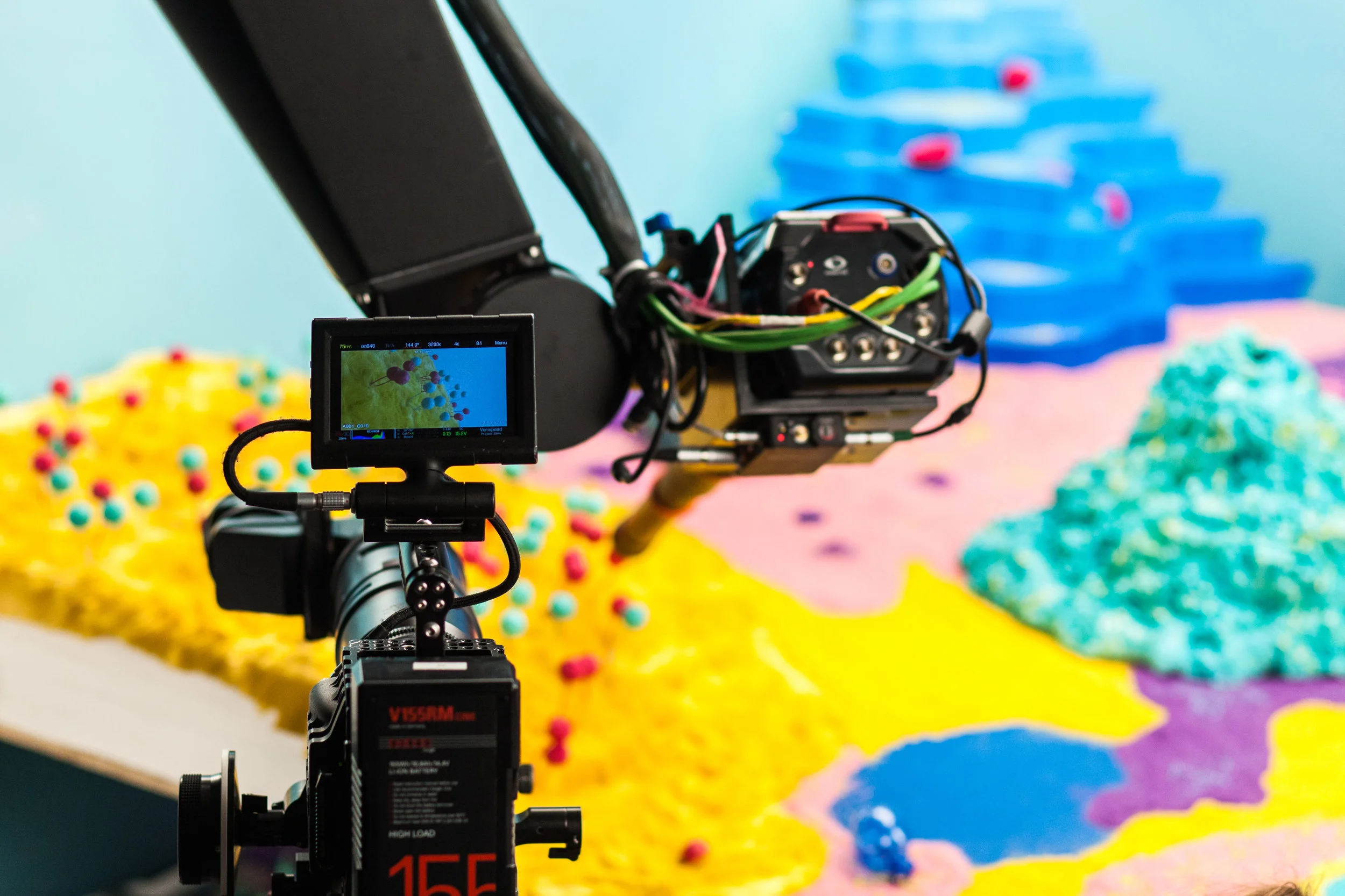
To re-launch Lenovo and their new logo to the world, we created a series of brand films. For this film we shot the entire visual ident in camera with a Phantom on motion control. We used materials like ferrofluid, water balls, dry ice, colored powders, and paints mixed with oils (even milk). We then mixed these with unexpected textures like fur, plastics, and glass.
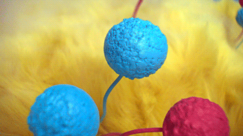
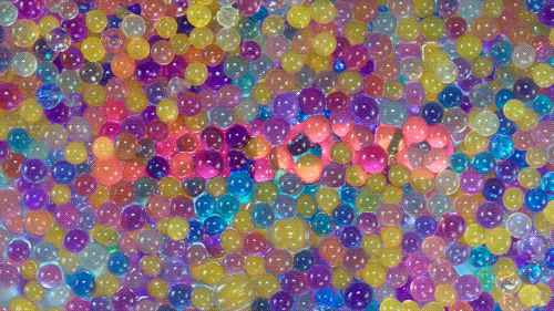
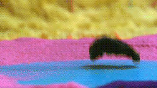
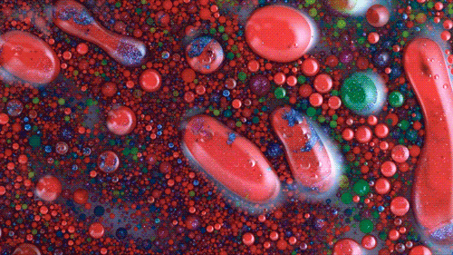
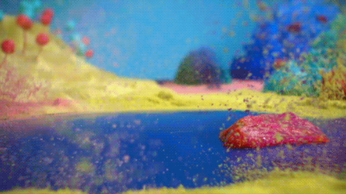
This creation out of tangible but wholly unexpected materials and extensive experimentation reflected Lenovo's matra of 'different is better'. Especially in a category dominated by Apple envy, little boxes, and a genuine fear of not being the same.

In the end, the unique visual ident that evolved matched the unique engineering philosophy of Lenovo. One that is founded on being unrestrained and uncompromisingly different. Get behind the scenes with the making of video above and images taken on set below.
Below is the initial ident used as proof of concept, the client liked it so much that it was used to introduce Lenovo at Tech amongst other tech shows across the world. The ident was created within my design team leveraging the team's multitude of skills and passions.
